TL;DR
- Adoption happens in layers: access, depth, workflow completion, outcome, and retention.
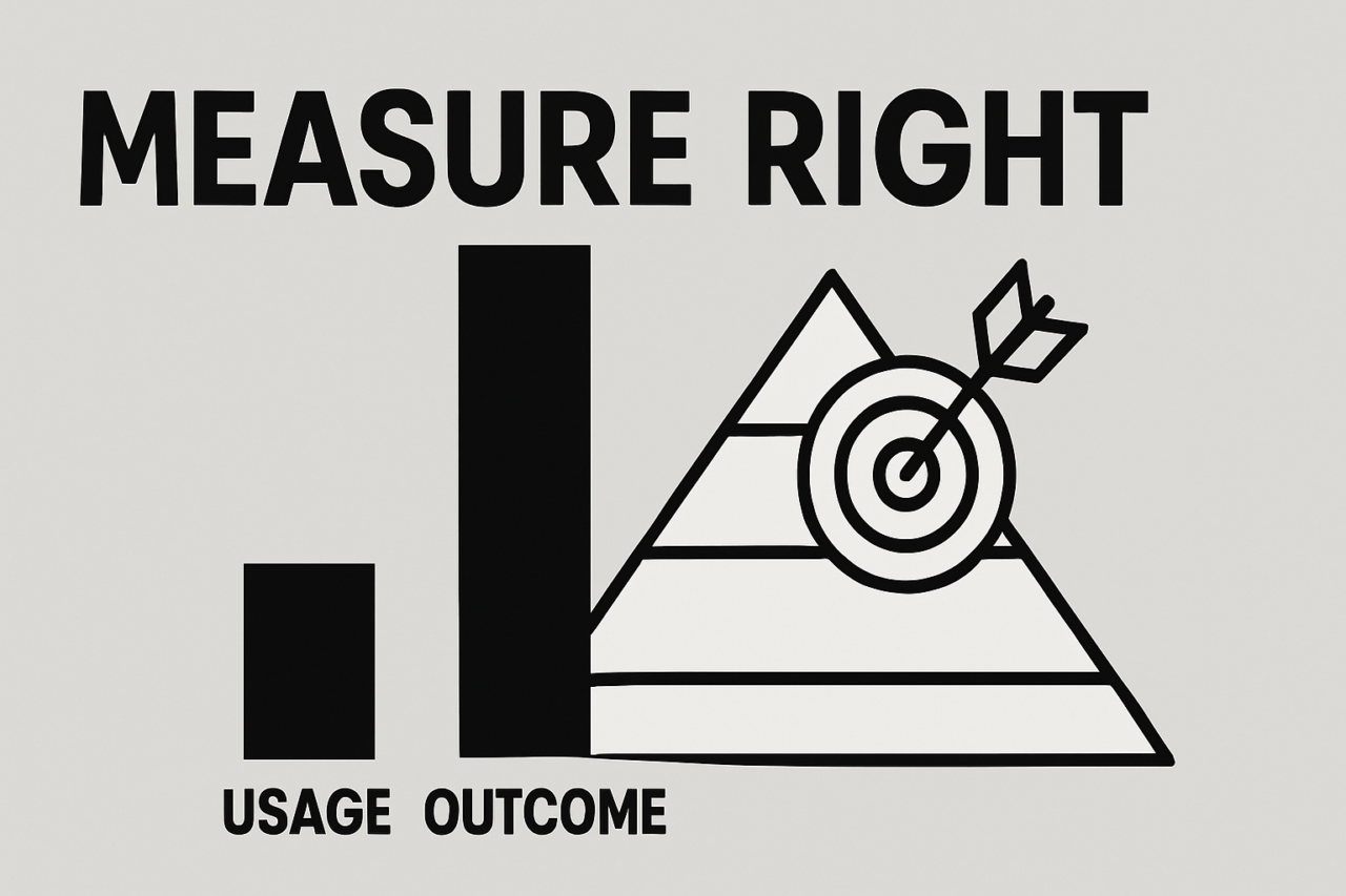
- Usage alone isn’t enough; measure value by tying activity to results and repeatability.
- Build a measurement plan with clear definitions, cadence, and governance to connect product usage to business impact.
- -link adoption to revenue indicators like time-to-value, renewals, and pipeline creation to show ROI.
Adoption Metrics That Matter: Usage vs Outcomes vs Retention is a practical framework for teams that want more than raw usage data. Tool usage can rise even when real value stays flat. By layering metrics, you can diagnose gaps, prove value, and sustain momentum. This article defines adoption metrics in layers, shares a concrete measurement plan, and shows how to tie adoption to revenue indicators.
Why Adoption Metrics That Matter: Usage vs Outcomes vs Retention
In many organizations, adoption is mistaken for activity. A user logs in, clicks around, and then—often—stops. That pattern yields a high access count but a weak signal for value. The goal is to move from counting who uses the product to understanding what gets done, what outcomes appear, and how often users stay engaged over time. The concept of Adoption Metrics That Matter: Usage vs Outcomes vs Retention centers on five layers that mirror real value creation: access, depth, workflow completion, outcome, and retention.
Layered adoption metrics: access, depth, workflow completion, outcome, retention
Adoption unfolds through stages. Each layer adds clarity about value delivery and helps prioritize actions.
Access (Active Users)
The access layer measures who can and does engage with the tool. Common definitions include daily active users (DAU), weekly active users (WAU), and monthly active users (MAU). The question to answer is simple: Are we expanding the set of people who touch the product? If access is growing but depth is stagnant, you may need a guided onboarding flow or targeted adoption campaigns. Track access trends by segment (department, role, region) to detect gaps early.
Depth (Features Used)
Depth answers, which features are adopted and at what rate. A feature-adoption score can summarize how many core capabilities a user group employs per session or per week. A rising depth score indicates that users are moving beyond surface-level engagement. If access grows but depth remains flat, you should surface quick-start templates, contextual tips, or in-app nudges that highlight underused functionality.
Workflow Completion (Tasks Done)
Workflow completion focuses on concrete work outcomes. Metrics include the number of completed tasks, created pipelines, or end-to-end processes finished. This layer answers whether the tool is helping teams move work forward. Pair task completion data with time stamps to measure time-to-complete and to identify bottlenecks in the workflow.
Outcome (Time Saved, Value Realized)
Outcomes translate activity into business value. Common indicators are time saved per task, reductions in cycle time, and improvements in throughput. You can also measure quality improvements, such as fewer rework items or higher on-time delivery rates. Outcomes are the bridge between product usage and business impact; they show whether adoption is generating tangible return.
Retention (Week-over-Week)
Retention tracks how often users return to the product over time. Week-over-week (WoW) retention provides a stable signal of ongoing value and habit formation. A healthy trajectory shows rising or stable WoW retention across cohorts; a declining pattern signals value erosion, onboarding gaps, or poor user experience. Use retention as a leading indicator for churn risk and to inform targeted re-engagement efforts.
How to build a practical adoption measurement plan
A thoughtful measurement plan creates discipline and clarity. The plan should answer: What will we measure? How will we measure it? What will we do with the data? Below is a concise blueprint you can adapt.
- Define the objective. Tie each metric to a business objective (e.g., reduce cycle time, accelerate time-to-value, increase renewal probability).
- Choose a cadence. Decide cadence by layer: access and depth weekly; workflow and outcomes bi-weekly; retention weekly to monthly cohort analyses.
- Standardize definitions. Document formulas for each metric: what counts as an active user, which features count toward depth, how you count a completed workflow, and how you quantify time saved.
- Identify data sources. Use product analytics for usage and depth, CRM for revenue-impact data, and project management tools for workflow outcomes. Combine data with time-tracking or payroll where needed.
- Set targets and baselines. Establish baseline metrics from historical data and set incremental targets aligned to business goals. Use guardrails to prevent gaming the system (e.g., inflated active-user counts).
- Create visual dashboards. Build dashboards that show each layer and its trend line. Include cohorts to reveal how new users progress through layers over time.
- Governance and cadence. Assign owners, schedule weekly review meetings, and create a feedback loop to adjust definitions as the product evolves.
As you implement, keep the plan actionable: it should tell you what to do when a metric crosses a threshold, who to notify, and which experiments to run next. A good plan turns data into decisions, not just numbers.
Tying adoption metrics to revenue indicators
Adoption matrices gain concrete business value when they link to revenue indicators. The journey from usage to money follows several paths:
- Time-to-value: Faster on-boarding and quicker realization of value reduce time-to-first-win for customers and shorten sales cycles.
- Renewals and expansions: High retention and deep feature use correlate with higher renewal likelihood and potential upsell or cross-sell opportunities.
- Pipeline creation: As teams adopt and standardize workflows, a higher rate of pipeline creation or project initiation becomes a leading indicator of future revenue activity.
- Efficiency gains: Time saved translates to cost savings; quantify saved hours and map them to cost avoidances or productivity gains.
- Churn reduction: Retention is a leading proxy for customer satisfaction; improvements here often predict lower churn and steadier revenue streams.
To connect the dots, pair adoption metrics with financial data. For example, track time-to-value improvements alongside deal velocity or onboarding SLAs. Compare retention and depth with renewal uplift. Finally, compute a simple ROI model: value delivered per user hour saved minus cost of deployment and subscription fees.
Practical example: a hypothetical adoption journey
Imagine a mid-market project-management tool introduced to three departments: Product, Marketing, and Customer Support. In week 1, access grows to 500 WAU across all departments, but only 120 users actively engage with the core workflow features. In week 2, depth softens: 60% of active users use at least two core features, and 45% complete at least one full workflow (a project kickoff and first milestone).
By week 4, workflow completion climbs to 180 completed pipelines, and the measured time saved per project drops from 6 hours to 2.5 hours. WoW retention improves from 65% to 78% as teams report faster onboarding and fewer context-switches. On the revenue side, renewal likelihood for the three departments increases from baseline by 12%, and one department breaches the threshold for an upsell, generating an additional 15% ARR uplift over the next quarter.
Key takeaway from this example: access might rise quickly, but meaningful value requires growth in depth, workflow completion, and outcomes that translate into retention and revenue. If you only chase the number of active users, you miss the signal that business value is actually materializing.
Visualization and practical tips
To keep teams aligned, use a simple visual: a layered funnel or stacked bar chart that shows each metric by cohort and over time. The purpose is to reveal gaps early and to show how improvements in one layer cascade into the next. For example, a dip in depth often predicts stagnation in workflow completion and weaker outcomes, which may in turn hurt retention.
Practical tips to maximize impact:
- Embed context in dashboards, linking every metric to a concrete action (e.g., a feature adoption card triggers a guided onboarding module).
- Highlight blockers where depth or workflow completion stagnates. Use in-app prompts or targeted training to address them.
- Track cohort differences to identify onboarding gaps by role or department and tailor interventions accordingly.
- Automate reporting so weekly reviews don’t require manual data wrangling. Spend more time analyzing trends and testing interventions.
Visual example: a layered funnel with five stages—Access, Depth, Workflow Completion, Outcome, Retention. Each stage shows the percentage of users advancing to the next stage by cohort. The chart helps leadership see where value stalls and where to invest in onboarding, feature education, or process improvements.
Conclusion: actionable takeaways and next steps
The key with Adoption Metrics That Matter: Usage vs Outcomes vs Retention is to stop equating activity with success. Adoption is a multi-layered journey that requires a deliberate plan, clear definitions, and a direct line to business outcomes. Start by measuring access, then add depth, workflow completion, and outcome, finally tracking retention to ensure value endures. Tie these layers to revenue indicators to demonstrate ROI and guide strategic decisions.
Next steps you can take today:
- Publish a one-page adoption measurement plan with exact formulas and data sources.
- Launch a weekly review focused on depth and workflow completion for top departments.
- Connect a simple ROI model to your dashboard to show how time saved and improved retention translate into revenue growth.
- Prepare an internal case study showing the link between adoption metrics and renewal or expansion opportunities.
By adopting this layered approach, you turn usage into value and value into sustained growth. Adoption Metrics That Matter: Usage vs Outcomes vs Retention is not just a framework; it is a practical path to measurable business impact.
Visual and supplementary resources
Recommended visuals: a layered funnel chart (Access → Depth → Workflow → Outcome → Retention) and a cohort-based retention curve. An actionable resource you can pair with this article is our Adoption Measurement Plan for deeper implementation guidance.
Closing thought
Adopt a disciplined measurement mindset. Start with access, build toward depth and workflow completion, and close with outcome and retention. When you connect these layers to revenue indicators, adoption becomes a reliable driver of growth rather than a simple usage tally.