TL;DR
- Adopt a cadence-based RevOps dashboard stack that separates weekly operator needs from monthly executive insights.
- Track seven core metrics that drive action: speed-to-lead, meetings held, stage conversion, cycle time, pipeline coverage, expansion rate, and churn drivers.
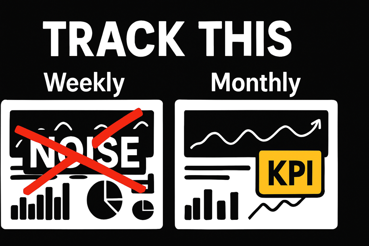
- Use weekly visuals for action, and monthly visuals for forecasting and strategy. Align definitions across tools to avoid misaligned numbers.
- Implement governance practices that ensure data accuracy, source cleanliness, and consistent time frames across CRM, marketing, and product data.
If you work in SalesOps or RevOps, dashboards should push decisions, not just display data. The goal is to replace vanity metrics with a compact stack that surfaces the levers you can pull this week and the levers that should inform strategy this month. This article outlines a practical RevOps Dashboard Stack: What to Track Weekly vs Monthly, with cadence-specific visuals, data governance guidance, and concrete examples you can implement today. For a quick read on design principles, see how a cadence-focused approach improves alignment across teams and tools. Internal guide: dashboard design for RevOps.
RevOps Dashboard Stack: What to Track Weekly vs Monthly
The core idea is simple: create two interoperable views that match the needs of two audiences and two time horizons. The weekly operator view shows actionable signals that drive day-to-day decisions. The monthly executive view aggregates outcomes to support planning, forecasting, and resource allocation. Both views rely on the same definitions and data sources, so numbers stay aligned as they flow from CRM, marketing automation, and product data stores. This alignment prevents the common problem of conflicting metrics across tools.
Weekly operator view: what to monitor now
Weekly monitoring focuses on speed, momentum, and early-stage quality. It helps front-line teams adjust priorities before the month closes.
- Speed-to-lead: average time from lead creation to first contact. A faster response correlates with higher meeting rates and faster cycle times. Track the weekly trend to identify bottlenecks in routing or SLA adherence.
- Meetings held: number of meetings booked and conducted by reps. Monitor by rep and by segment to surface coaching opportunities and capacity constraints.
- Stage conversion (by stage): percentage of leads moving from one stage to the next within the week. Highlight stages with drop-offs so reps focus on qualification or next-step actions.
- Cycle time to close: average duration from opportunity creation to close for deals initiated this week. Shorten slow cycles by removing friction in the proposal or legal steps.
Visuals for weekly views could include a line chart for speed-to-lead over the last 7–14 days, a stacked bar for weekly meetings by stage, and a heatmap showing conversion volatility across reps. Keep the data refresh at least daily to ensure freshness, but avoid overloading dashboards with too many toggles. A practical weekly operator view example is described in the scenario section below. For more on visual strategies, see our cadence-based dashboards guidance.
Monthly executive view: what to forecast and optimize
The monthly view aggregates results to reveal trends, capacity gaps, and strategic risks. It answers questions about pipeline health, revenue certainty, and customer retention drivers.
- Pipeline coverage: pipeline value divided by quota or forecast. A healthy range reduces last-mile risk and supports confident planning. Track coverage by product line, region, and sales stage.
- Expansion rate: revenue growth from existing accounts due to upsell, cross-sell, or price changes. This metric signals the health of account management and product-market fit.
- Churn drivers: root-cause indicators behind lost or at-risk accounts (onboarding issues, feature gaps, price sensitivity). Surface actionable themes for product and customer success teams.
- Forecast accuracy: closings versus forecasted revenue. Accuracy improves planning and quota setting and helps identify data gaps in opportunity scoring.
Monthly visuals might include a pipeline coverage gauge, a cohort-based expansion rate chart, and a churn-driver heatmap showing top causes by product line. The executive view should be lean—clear signals, not a data dump. Internal link: dashboard design for RevOps teams.
Core metrics in the RevOps Dashboard Stack: What to track and why
These seven metrics form the backbone of the stack. Each metric has a clear definition, a data source, and a target that aligns with a given cadence. You’ll likely implement a standard set across tools and then tailor by industry, territory, or product.
- Speed-to-lead — Why it matters: faster initial contact increases meeting rates and shortens the overall cycle time. How to use: monitor weekly, and set a target improvement each sprint.
- Meetings held — Why it matters: meetings drive opportunities. How to use: measure by rep and by segment to adjust routing and coaching.
- Stage conversion — Why it matters: leakage at any stage signals qualification gaps or process friction. How to use: identify bottlenecks and implement next steps or playbooks.
- Cycle time — Why it matters: long cycles reduce revenue velocity and hurt forecast reliability. How to use: target reductions through process simplification and automation.
- Pipeline coverage — Why it matters: coverage above quota reduces risk and enables strategic investments. How to use: align coverage targets with seasonality and product mix.
- Expansion rate — Why it matters: growth from current customers signals product satisfaction and adoption. How to use: drive account planning and renewal strategies.
- Churn drivers — Why it matters: understanding why customers leave informs product and onboarding improvements. How to use: joint action plans with CS, product, and sales to address root causes.
Each metric should be defined once, with a single source of truth. For example, define speed-to-lead as the elapsed time between lead creation in the CRM and the first sales activity logged by the account executive. Use the same time window across tools to ensure consistency. If your organization uses multiple CRMs or MAPs, map fields to a canonical form to support cross-tool reconciliation. For more on data harmonization, see the data governance section below and the linked internal guide: data governance for CRM data.
Cadence-based dashboard design: weekly vs monthly specifics
Cadence design means tailoring visuals, targets, and actions to the needs of the audience and the time horizon. The weekly view emphasizes speed, action, and short-term adjustments. The monthly view emphasizes trends, risk, and strategic decisions. To implement effectively, define data refresh frequencies, ownership, and escalation paths upfront.
Practical cadence tips
- Definitions must be shared and locked. Create a single glossary and publish it to your data catalog.
- Source mapping should be documented. Identify the canonical source for each metric (CRM, MAP, or product telemetry) and how data flows between tools.
- Ownership must be clear. Assign a data steward for each metric and a dashboard owner for each cadence view.
- Automation should minimize manual data manipulation. Use scheduled exports, transformations, and validation checks to maintain integrity.
As you design, consider how the numbers will be used by different roles. For example, a weekly operator view should be actionable in under 60 seconds, with a single chart showing the most critical signal. The monthly executive view can include a dashboard summary with a few high-signal charts and a link to deeper drill-downs in a separate report. See our cadence guide for weekly vs monthly dashboards for templates and examples.
Data governance: making numbers match across tools
Numbers that don’t align undercut trust and slow decision-making. Implement a practical governance plan that covers data definitions, lineage, quality checks, and refresh schedules. Start with these steps:
- Define metrics precisely: provide exact calculations, time windows, and filters. Publish the definitions in a central document and reference it in all dashboards.
- Standardize data sources: choose canonical sources for each metric and map fields from CRM, MAP, and product analytics to those sources.
- Automate data quality checks: schedule daily quality checks that compare key fields (e.g., close date, stage, ownership) across tools and alert data owners when discrepancies exceed thresholds.
- Synchronize time frames: ensure the same date granularity and time zones across dashboards (e.g., week-start Monday, month-end last day).
- Assign data owners: assign a data steward for each metric and establish an escalation path if data quality drops.
Governance also means documenting data lineage. If a metric is derived, note the derivation and the source, so any dashboard user can trace how the value was produced. For teams using multiple CRM or marketing tools, a reconciliation report that surfaces differences by data source helps teams address gaps quickly. Internal resource: RevOps data governance playbook.
A practical example: turning the stack into action
Imagine a mid-market SaaS team that notices weekly speed-to-lead is creeping up and weekly meetings held are flat. The weekly operator view highlights this trend and points to routing and SLA adherence as the likely cause. The team investigates and finds that new inbound channels are routed to reps with longer first-response times. They implement a 15-minute SLA check-in for leads sourced from the top inbound channel and reassign routing rules to balance load among reps. Within two sprints, speed-to-lead improves, meetings held rise, and weekly cycle time drops. The monthly executive view then shows improved pipeline coverage and a more favorable churn-driver profile as onboarding experiences improve. This example demonstrates how the two cadences complement one another: weekly signals drive quick fixes; monthly signals confirm strategic impact. A well-designed RevOps Dashboard Stack supports both, reducing guesswork and accelerating revenue velocity. Internal link: pipeline management and forecasting.
Visuals that reinforce the message
Consider the following visuals for both cadences. They should be simple to interpret at a glance but capable of drilling into detail when needed.
- Speed-to-lead trend line (weekly): shows daily or hourly response times and highlights recent shifts.
- Meetings by stage (weekly): stacked bars by stage to show where meetings convert or stall.
- Stage conversion funnel (monthly): a compact funnel with conversion rates between stages and a note on any bottlenecks.
- Pipeline coverage gauge (monthly): a dial or gauge displaying coverage ratio against target.
- Expansion rate and churn drivers (monthly): paired charts showing expansion and root causes by segment.
- Forecast accuracy (monthly): planned vs actual revenue with a simple delta visualization.
For visuals, pair charts with concise annotations that call out the recommended actions. An annotated infographic can be useful for executives, while a lean set of charts with drill-down links serves operators well. If you need a quick reference, use the linked internal resources to adapt templates to your data stack: dashboard design and CRM data governance.
Putting it all together: a simple rollout plan
1) Define metrics and sources in one week. 2) Create two dashboards (weekly and monthly) that point to the same data sources. 3) Implement daily quality checks and weekly reconciliation. 4) Pilot the cadence with a small team, gather feedback, and refine definitions. 5) Roll out to the broader organization with governance documentation and training materials.
By focusing on a targeted RevOps Dashboard Stack: What to Track Weekly vs Monthly, you build dashboards that drive action and inform strategy. The cadence alignment reduces ambiguity, while governance ensures numbers match across CRM, MAP, and product data. This approach helps teams execute with confidence and forecast with clarity. If you’re ready to start, review your current dashboards, map your data sources, and begin with speed-to-lead and pipeline coverage as your first two metrics to standardize across tools.
What to do next
- Audit your data sources and map to a canonical schema.
- Publish a metric glossary and assign data owners.
- Design two dashboards with shared definitions and distinct audiences.
- Implement daily data quality checks and weekly reconciliation rituals.
- Share the cadence guide with your team and collect feedback for continuous improvement.
Ready to implement? Start with speed-to-lead and pipeline coverage in your weekly and monthly dashboards, then expand to expanders and churn drivers as you mature. The goal is clear—convert dashboards into decisive actions that accelerate revenue. For more practical guidance, explore related topics in our RevOps resources: dashboard design and cadence-based dashboards.